Portfolio case study · Web design & product
A kibbutz newspaper, rebuilt as a living community platform
Design, UX and build for the weekly newsletter of Kibbutz Netzer Sereni, Israel. Hebrew, right-to-left, read mostly on phones by residents of every age.
- Base44 · React + hosted data
- Public site + editorial admin console
- alonetzer.digital ↗
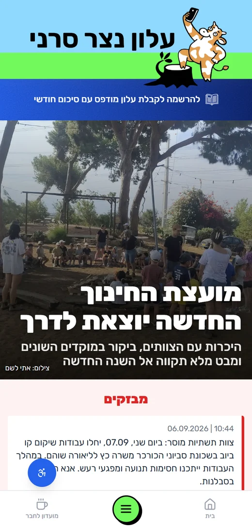
Home
A front page, not a feed
The layout borrows newspaper hierarchy so the community reads it like the paper they already know.
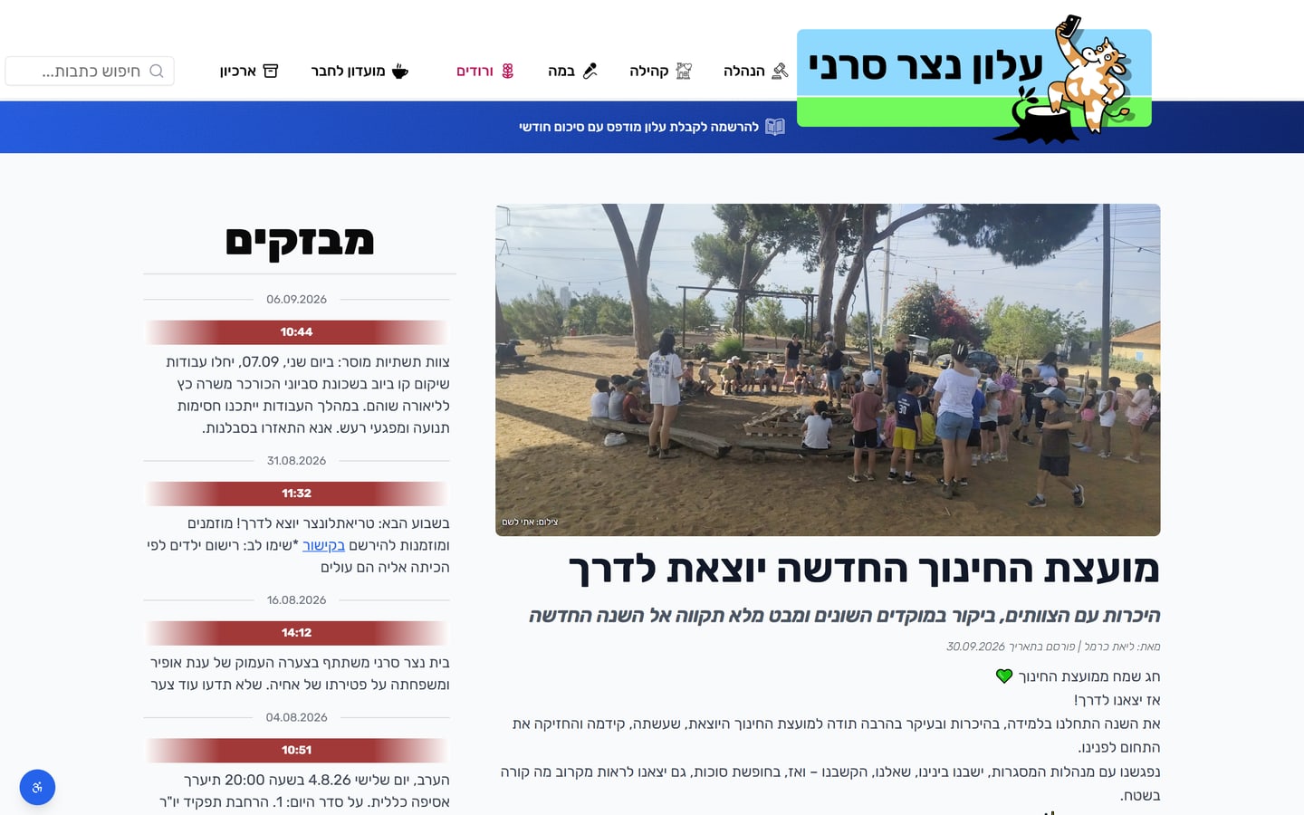
One lead story, full width
A large photo and a 50 px headline give the page a clear entry point. Editors can pin any article as the lead or let the newest take over.
“Flashes” as a red ticker
Short alerts (road works, votes, condolences) sit in a dated side column with red time stamps, so urgent items never compete with features.
Tunable typography
Headline, subtitle, flash and date sizes are settings, not code. Editors adjust hierarchy without a redeploy.
Playful brand, serious grid
The mascot cat and lime stripe carry warmth; underneath, a strict two-column grid keeps reading calm.
Sections and articles
Color-coded rooms
Each section owns a tint and an icon, so readers know where they are before reading a word.
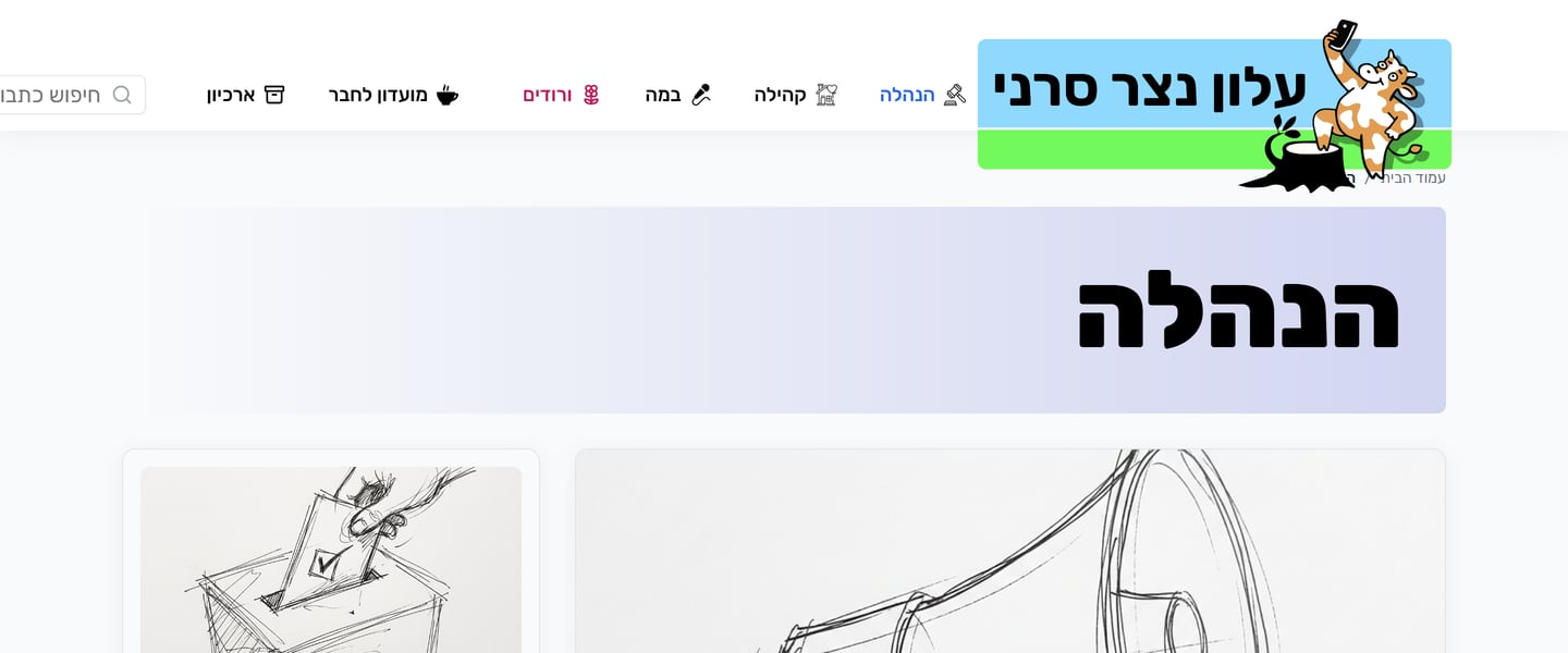
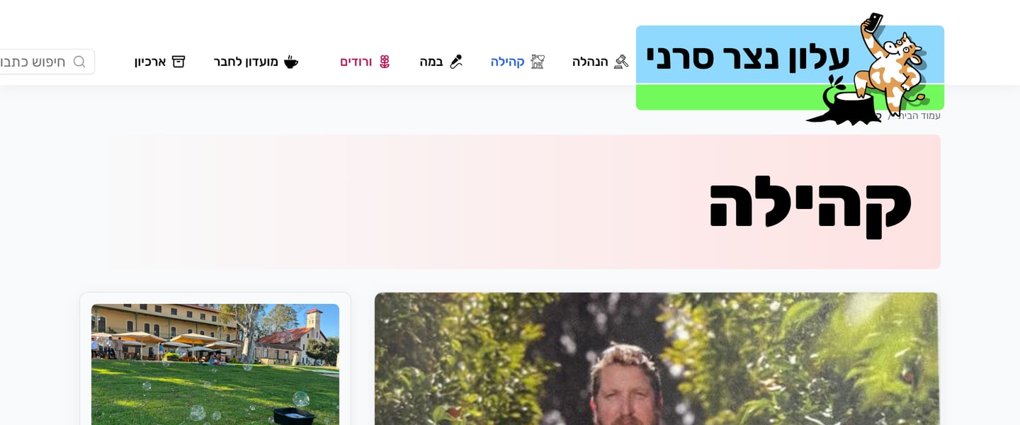
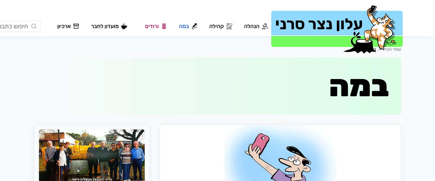
Section header as a signal
A soft gradient band with the section name in heavy Rubik replaces a generic page title. The tints repeat in nav icons and category chips.
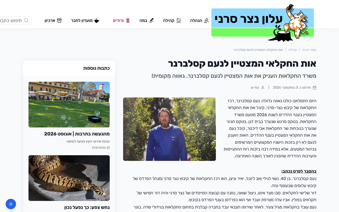
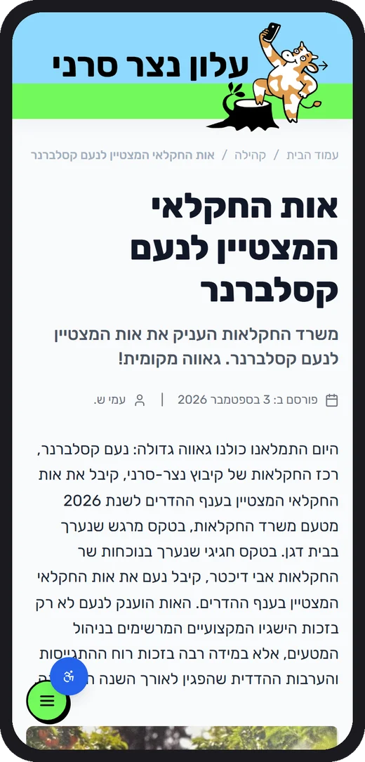
Reader-first article page
A single measure-controlled column, byline and date on one line, a related-articles rail, and image credits placed on the photo.
Art direction per device
Each article stores a desktop and a mobile lead image with its own focal point, so faces are never cropped on phones.
Access levels
Articles can be limited to kibbutz residents; the reader sees a polite gate, not a broken page.
Mobile first
One thumb, one green button
Most residents open the newsletter from a WhatsApp link on their phone, so the phone layout was designed first.
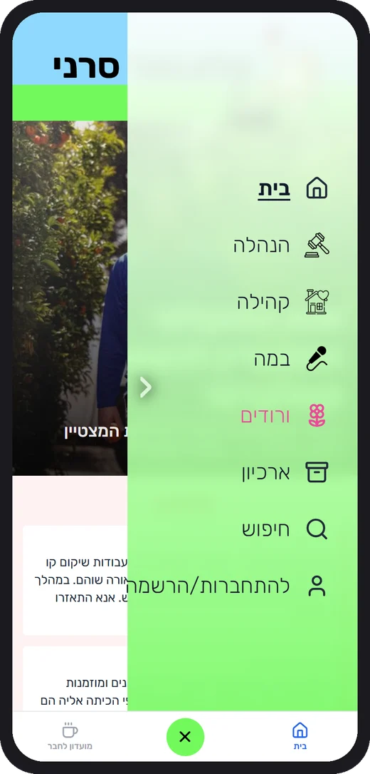
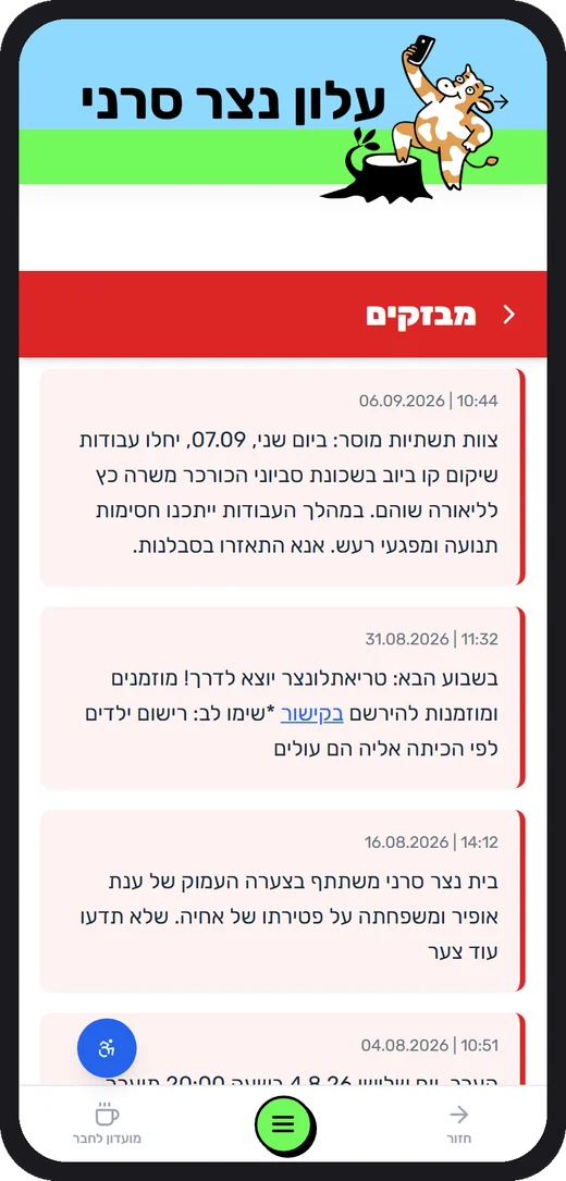
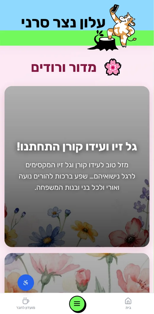
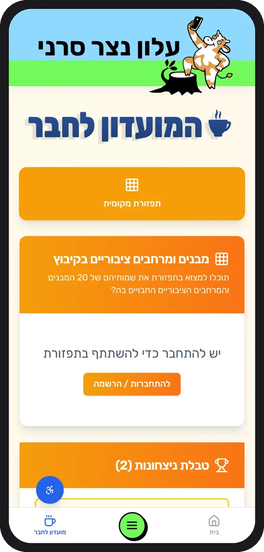
A three-target bottom bar
Home, a big lime menu button in thumb reach, and the Members Club. Nothing hides in a hamburger corner.
Full-screen menu, same order as desktop
The overlay lists the sections with their icons, plus search and sign-in, so the mental model does not change between devices.
Header that stays recognisable
The mascot header collapses on scroll but keeps the sky-blue and lime bands visible.
Native-feeling details
Pull-to-refresh, a red flash timeline with date pills, tap-through cards, and push notifications for new content.
Designed for a neighbour, not a customer
Wandering, not scrolling
A commercial news site is built to keep you. A community newsletter is built to inform you, connect you, and let you go.
| Commercial news site | Community newsletter (this site) | |
|---|---|---|
| Why the reader comes | Habit and headlines; every story competes for a click and an ad impression. | To find out what is happening to people and places they know: a vote, a road closure, a wedding. |
| Who the reader is | An anonymous consumer, one of millions. | A neighbour and a member, sometimes the subject of the story. |
| How they move | An endless, algorithm-sorted feed engineered to keep scrolling. | Short, predictable paths: front page, three sections, one menu, search. You finish and leave in minutes. |
| What success means | Time on site, page views, ad revenue. | Information delivered, a decision understood, a greeting shared, a neighbour helped. |
| Tone of voice | Neutral, urgent, interchangeable. | Warm and local, first names, the same voice as the printed paper. |
Wayfinding you never have to learn
The same six destinations on every screen, the mascot as a constant landmark, and section tints that tell you where you are.
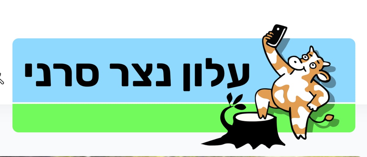
A visual language the kibbutz already speaks
The mascot cow and the sky-and-grass masthead come straight from the printed paper. Readers recognise the site as “our alon” in one glance.


Type
One family, Rubik, from black to light. Its rounded Hebrew letterforms read friendly rather than corporate, and the heavy headline weight echoes a newspaper masthead. Body text stays large (18 px) for older readers.
Colour as meaning, not decoration
- Skymasthead
- Grassstripe, menu button
- Redflashes, urgent
- PinkVroodim, joy
- Bluelinks, actions
- CreamMembers Club
Everything else is white and grey, so a red pill always means “read this now” and a pink page always means “someone is celebrating”.
Admin console
A newsroom CMS for volunteer editors
Editors are community members, not developers. The console hides complexity behind nine plain tabs.
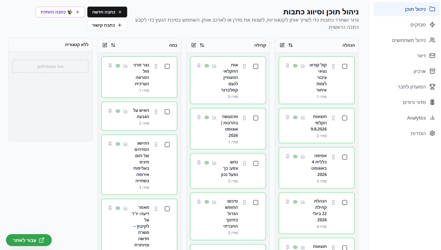
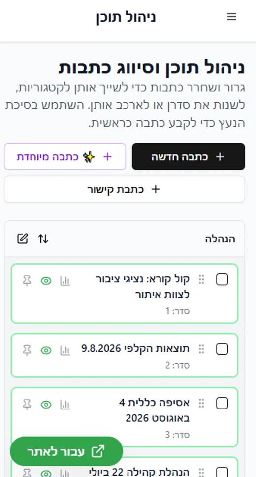
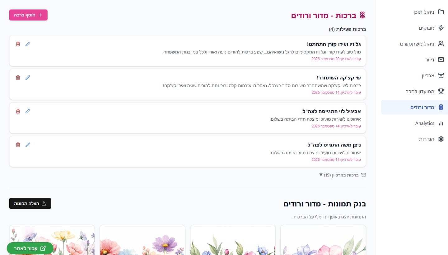
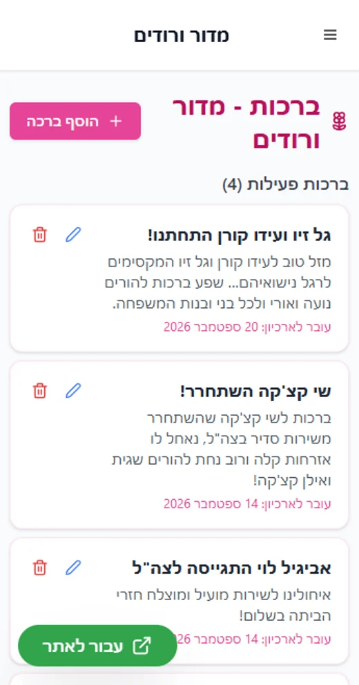
Dashboard tabs & who sees them
- Content
- Flashes
- Users
- Mailing
- Archive
- Members Club
- Vroodim
- Analytics
- Settings
also open to content editors main editor only. Two roles, one password-protected door on top of Base44 sign-in.
Block-based article editor
Text, image, row (two columns), button and file blocks; title/subtitle styling; desktop and mobile lead images with focal-point control; custom cover generator.
Publishing controls
Drafts with unpublished-changes flag, scheduled publish, pin to homepage, section and tag assignment, residents-only access, preview mode.
Reach & insight
Email digests and push alerts with send history, seasonal cover stripes with start/end dates, and analytics by article, user and hour.
Why it works
Three lenses on the same decisions
Visually
- A single display face (Rubik) at heavy weights gives Hebrew headlines a newspaper voice.
- Restrained white grid; colour arrives only as meaning: section tints, red for urgent, pink for joy.
- The mascot and lime stripe are the one playful constant on every screen.
Conceptually
- Not a blog: a front page, sections, a ticker and an archive, mirroring the printed paper people trust.
- Community rituals (greetings, games, calendar) live inside the newspaper instead of in scattered WhatsApp groups.
- Editors keep editorial control through pinning, ordering and scheduling.
Usably
- Thumb-reach navigation and a full-screen menu on mobile; classic top nav on desktop.
- Accessibility widget (contrast, font size), open-access mode, and resident-only gating for sensitive items.
- Push and email digests bring readers back; analytics show editors what landed.
See it live
The newsletter is read every week by the residents of Netzer Sereni.